To understand the psychological impact of your website, try to think of it as an actor on a stage. If it puts on a good performance, people will be waiting in lines to watch your show in the future. Conversely, if your site elicits yawns of boredom from the audience, they might stick around for a while, but they probably won’t be showing up next time. And if your site really ruins its performance, you will be dealing with a barrage of rotten tomatoes long before the first act is over. The outcome which you will receive depends on how successful your website is at mesmerizing the audience, so it’s not a surprise that so many users are hiring website agencies.
To improve the odds of receiving bouquets for your #site’s #performance, you can utilize some clever #psychological tricks throughout the #design process. Read about four such tricks in the rest of our article below. Click To Tweet
Utilize F-Patterns and Z-Patterns for Text Formatting
As a web designer, you can exert a lot of influence on how people behave while viewing the content of your site. For example, if you know the psychology behind eye movement, you can modify the way your content is formatted to create a more positive reading experience. There are two main patterns in which people scan content with their eyes, the Z-pattern and the F-pattern.
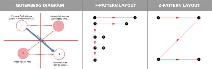
The Z-pattern layout simply follows the shape of the letter Z. This pattern traces the way our eyes move while reading the text – it goes left to the right, top to bottom, zigzagging until it reaches the end of the page.
Z-pattern reading often happens on pages that aren’t centered on the text. For this reason, the Z-pattern is a good option for simple designs with little text, and a small number of key visual elements.
The F-pattern layout is a bit more complicated. Viewers will typically move their eyes horizontally across the upper area of your content. They will then move their gaze along a vertical line to the left side of the screen in order to find points of interests within the initial sentences. Once they find something interesting, they will once again look horizontally, usually covering a shorter area than the first time.
The F-pattern is great for creating a visual hierarchy on a web page. It also closely maps to movements our eyes make while reading, making the experience instantly familiar.
Choose Colors that Complement Your Design
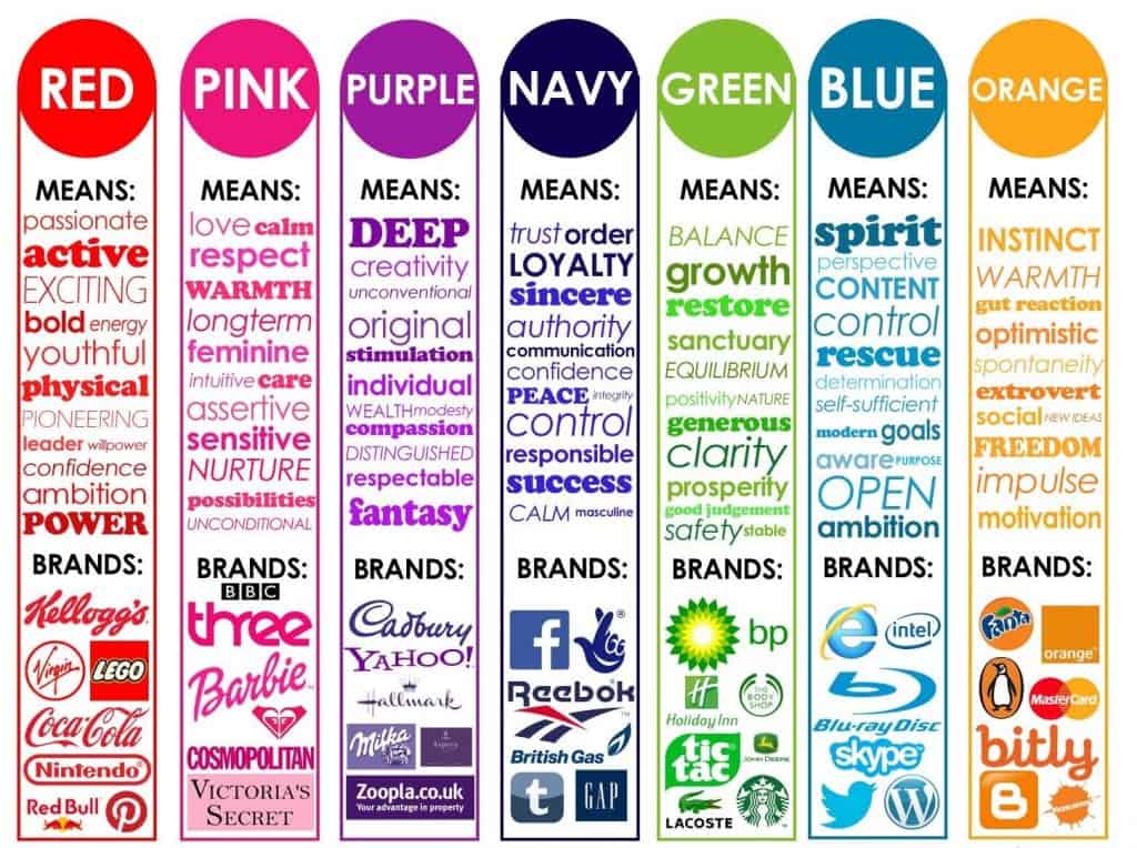
Color is another important design element that can elicit strong emotional responses in site visitors. It has an influence on how people think, feel, and behave. Utilizing the psychology of color in your design can raise brand awareness, improve sales, and nudge visitors to take specific actions on your website. Everyone perceives colors differently based on their genetic makeup, psychological type, and cultural background.
Nevertheless, there are some commonalities in the way people experience each color. Let’s go over some of the basics:
- Red is commonly associated with love, lust, excitement, movement, and energy. On the flip-side, it is also associated with negative notions such as violence, danger, war, anger, and fire. Red can be used to draw attention to something or to create excitement. Red is also good for fashion, food, sports, entertainment, marketing, emergency services, and healthcare.
- Yellow is usually correlated with concepts such as happiness, optimism, competence, youth, and cheer. Less favorably, yellow is associated with deceit, cowardice, sickness, and cheapness. Yellow can be used to energize people and create a sense of happiness and bliss. Softer yellows can induce calmness. Yellow is also great for drawing attention to CTA buttons.
- Blue often reminds people of ideas such as competence, quality, calmness, dependability, steadfastness, masculinity, strengthen, wisdom, loyalty, trust, and safety. It can also produce feelings of sadness, depression, longing, and melancholy. Top web companies commonly use blue because it is non-invasive and associated with dependability. It’s also good for health care, dental, medical, science, government, utilities, and legal services.
Add Maps to Increase Site UX
Maps are a frequently underutilized element of website design. With a little bit of creativity and the right tools, an embedded map can greatly enhance the UX of a website. Adding a map that points to your business encourages trust – if people can find you, and speak to you in real life, they are more likely to trust you.
Interactive maps can be used to invite action from site visitors, thus increasing engagement. This will transform a map from a primitive and unremarkable website element, into one that can act as a visual centerpiece of your design. Interactivity can be achieved using effects, subtle motions, multimedia-based tooltips, dynamic pointers, etc. If used in conjunction with surveys, polls, and other forms of user feedback, maps can acquire the ability to represent information in real time.
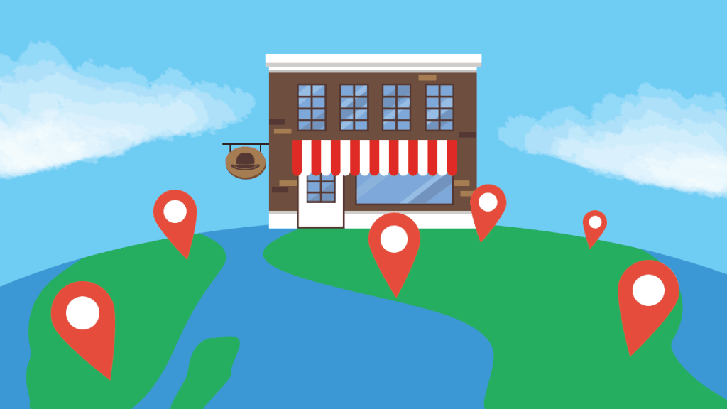
Showing relationships between different types of data is much easier when the user has the power to change the visuals of their own accord. Maps can also be used to provide a more personalized experience to site visitors. For example, a map makes it much easier to find stores near the visitor’s location, which is especially important for people that tend to browse the web from mobile devices.
Improve Communication through Typography
Communication plays a crucial role in web design – it is essential for establishing an immediate connection between your website and the user. In the context of web design, communication is mostly enacted via means of text. This makes your choice of typeface an important aspect of web design, and this is something a top web design company is well aware of, so make sure you do your research properly regarding typeface. Good typography makes the act of reading effortless, while poor typography is likely to cause headaches in your visitors.
Using more than three different typefaces can make a website look unprofessional. In general, try to limit the number of font families you use to a minimum and stick to the same ones throughout your entire website. If you decide to use more than one font, be sure that the font families harmonize with each other.
Site visitors will access your website from devices with different screen sizes, so it’s important to choose a typeface that works well in multiple sizes and weights to maintain readability and usability. Try to avoid using typefaces that use cursive script, as these are more difficult to read when scaled down.
Some typefaces make it too easy to confuse similar letters, due to poor letter spacing. So when choosing your typeface, be sure to check how it works in different contexts to ensure it won’t cause readability issues for your site visitors.
Conclusion
All web design is ultimately based on psychological principles because the role of a website is to provide a certain kind of user experience. From your choice of color to the way content is arranged, to the elements that are present on the page, you always have psychology working in the background, and it is up to you to ensure that it works in your favor.
Comments are closed.