When a visitor lands on your page, you have a few seconds before they bounce. A map gives clarity and trust. A quiz adds relevance and engagement. Together, they turn a passive glance into an active step.
Add a map to show where you are. Place a lead genetarion quiz nearby to spark interaction. One builds credibility, the other personalizes the offer. That combination drives conversions without feeling pushy.
Why maps still matter
A map answers the first question: where exactly. Three quick wins:
- Trust. You look real, not abstract.
- Clarity. Directions beat paragraphs.
- Momentum. Clicking to expand the map is a first micro-conversion.
Lightweight map widgets keep load time fast, especially on mobile.
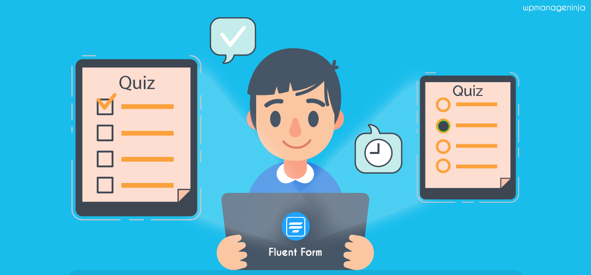
Why quizzes convert even faster
Quizzes trade answers for answers. They get micro-commitments, feel personal, and end with one clear CTA. The result page isn’t generic—it’s tailored to the visitor, which makes action feel natural.
Placed near a map, the quiz reinforces it: map reduces risk, quiz raises intent.
How it works for different audiences
Bloggers
- Map: show the café, trailhead, gallery.
- Quiz: “Plan your perfect 2-hour walk” or “Find your coffee match.”
- Payoff: a custom itinerary, with “Email me this plan” as CTA.
Agencies
- Map: office or studio proof.
- Quiz: short fit check (budget, scope, goals).
- Payoff: a score or lane—“best fit for a discovery call” or “start with an audit.” Offer a matching CTA.
Local businesses
- Map: locations or clustered pins.
- Quiz: needs and timing (“morning/evening,” “accessibility”).
- Payoff: nearest branch with hours and a “Reserve” or “Call now” button.
Placement that feels human
- Map thumbnail mid-viewport with a simple caption.
- Quiz teaser right below: one sentence, one button.
- Result card with two clear next steps, not a wall of text.
- Footer extras: hours, FAQ, contacts.
Writing a quiz that works
Keep it light:
- Hook: “Plan a route in 60 seconds.”
- 4–7 steps, mostly multiple-choice.
- One optional open field.
- A branching skip for speed.
- Reward: visual result card with map snippet and two concrete actions.
Gate only the deeper resource (PDF, checklist), not the basic result.
Linking the map and quiz
- Sync names between pins and options.
- If the quiz recommends a branch, the map should zoom there.
- Show context in the result (“Evening hours today”).
- Respect intent: soft CTA for researchers, direct booking for ready buyers.
Keep it fast and mobile-ready
- Lazy load map: thumbnail first.
- Keep the quiz lean—compress images.
- Large tap targets.
- Short, verb-first labels.
Track simple signals
- Map expand rate: do captions invite clicks.
- Quiz start rate: does the teaser spark curiosity.
- Quiz finish rate: find and fix the drop-off step.
Add one optional “Was this useful” question. Qualitative signals show where to improve.

Mistakes to avoid
- Hiding the map too far down.
- Quizzes with 10+ questions (feels like a form).
- Generic results like “Thanks, we’ll be in touch.”
- Name mismatches between quiz and map.
- Gating value too early.
Quick build checklist
- Place a thumbnail map with a clear caption.
- Draft 4–7 quiz beats with one logic jump.
- Write a specific result card with two next steps.
- Test mobile layout with your phone.
- Track three simple ratios weekly.
The bigger picture
A map shows you exist. A quiz shows you care. Together, they move visitors from “maybe later” to “I know what to do next.” Start with one page and one quiz, track signals, refine. Expand once you see the lift. Maps prove the where. Quizzes guide the what. Your role is to make the how feel effortless.