Your website’s design is one of the single most important factors when it comes to running an eCommerce site. After all, the way that it looks and feels will have a direct impact on vital metrics such as conversion rates and time on site.
Making your website look its best is mission critical. Looks aren’t everything, but they do have a big impact on the way that your brand and its products are perceived. You wouldn’t want to eat in a restaurant that had greasy walls and a dirty carpet, so why give customers the virtual equivalent from your eCommerce store?
We want your #customers to have the best browsing experience possible. That’s why we’re sharing the 25 biggest #eCommerce #design mistakes that you’ll want to avoid. Click To TweetLet’s go. Avoid these mistakes to have visitors throwing money at your eCommerce store.
Not exporting your orders
One mistake many store owners make is thinking they can keep track of all of their orders without ever exporting the data. This can lead to some big trouble as orders tend to pile up.
Avoid landing yourself in that situation by using WooCommerce Order Export. Using this plugin’s features, you can get reports on your order data in CSV format in your inbox or through FTP. The reports can be created automatically/on a schedule, so you lose all worries associated with that.

What’s more, the plugin knows which orders have already been exported so you won’t get the same report over and over again, only fresh data.
Not using advanced shipping rules
Determining shipping sounds easy, but you can’t apply the same shipping rules to all your orders. Why? Because a lot of factors come into play such as destination, weight, quantity, and cart total. For that reason, implementing advanced shipping rules is a must.
You achieve this using a plugin like WooCommerce Table Rate Shipping. It can be your go-to for creating shipping methods which you can name any way you would like, import/export, hide, and forcibly use.
One very important feature of the plugin is its ability to implement shipping rules for logged-in users only, taking your shipping game up a notch.
Choosing the wrong shopping cart
This is arguably the most important decision you’ll make. Bad shopping cart software can turn people off just as they’re getting ready to pay and will ultimately sink your eCommerce site before you get started.

But there is another option, which is completely skipping the cart. How? You just install a plugin like Direct Checkout for WooCommerce and let it do its magic.
This plugin creates something called buy buttons which enable customers to skip the cart and be redirected to the checkout instantly. The buttons can be placed anywhere on a site and be used for all products or just individual ones.
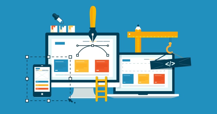
Bad images
A picture tells a thousand words, but a bad picture does more harm than good. If you’re struggling, consider investing in a professional photographer.
Poor search functionality
You can’t expect people to spend their money through your eCommerce store if they can’t find what they’re looking for. Make sure that your search functionality allows for advanced searches and segmentation and keep your eyes peeled on the error logs.
Poor browse functionality
Not everyone comes to your site knowing exactly what they’re looking for. As well as allowing people to search, you’ll also want to allow them to browse and to dig down deep into different categories.
Not using secure connections
Secure connections need to be built into the very foundations of your website so that people can shop with confidence. Not using a secure connection can have a hugely detrimental effect on your conversion rate and even lead to customers’ data being compromised.
Default images/descriptions
Using default product images and descriptions from the manufacturers means that you have no point of difference when compared to your competitors. It can also mean that your designers are forced to use boring, lifeless product images when they could be doing something awesome instead.
Clunky navigation
A lot of the tips we’re sharing here all boil down to a pretty simple philosophy, which is that it’s the designer’s job to make it as easy as possible for visitors to find their way around. Getting the navigation right is just part of it.
Failing to proofread accurately
One research revealed that a single spelling mistake could cut eCommerce sales in half. This is particularly relevant if designers are tweaking the copy to make it fit with the design. Consider using an online proofreading service. The best design in the world won’t help if your content isn’t up to scratch.

Long checkout processes
Amazon’s 1-click process has been such a success because it makes it as quick and easy as possible for people to finish their purchase. Every extra step reduces the likelihood that shoppers will complete their order.
Unreadable fonts
The fonts you choose should highlight the website’s copy instead of making it more difficult for people to read it. And remember that what’s easy to read for one person might not be so easy for another.
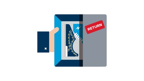
Not including delivery/return options on product pages
Simply ensuring that this information is included can fill shoppers with confidence and make all the difference when it comes to whether they hit that “buy now” button.
No FAQs
FAQs are FAQs for a reason. If your visitors are frequently asking the same questions, then you need to make sure that you answer them.
No recommendations/related items
Recommendations and related items are a great way to cross-sell to people by highlighting products that they might not even know that you stock.
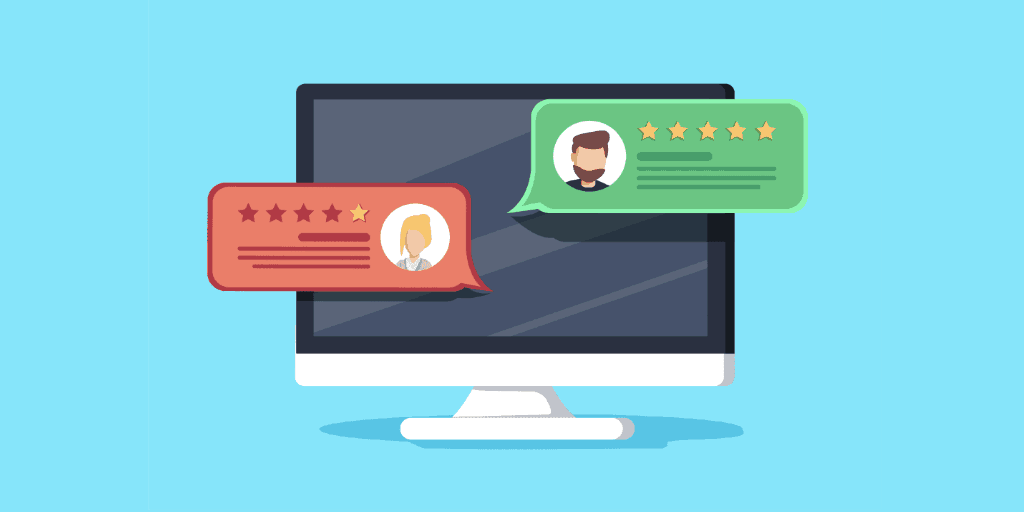
No rating functionality
People love to see ratings and reviews before they buy. This phenomenon is called “social proof,” and it can have a real impact on your conversion rates. Simply including ratings and review functionality on a website can make a big difference.
Lazy calls-to-action
The calls-to-action on your website should be constantly tested and refined so that they’re being put to good use. Try different language, colors, and sizes to see what makes people most likely to convert from visitors to customers.
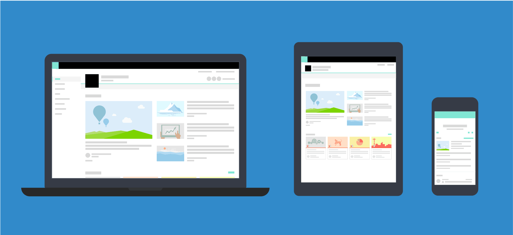
Not optimizing for mobile
If your website isn’t optimized for mobile devices, then you’re effectively pushing mobile shoppers away. In fact, 40% of users will go to a competitor after a bad mobile experience. Don’t give them a reason.
eCommerce shoppers want to see shipment and refund/replacement information before they purchase
Large images/videos
Large files slow down the browsing experience and can stop your site from loading altogether, especially on mobile. Use compression or avoid them altogether.
No images/videos at all
Images and videos should be used sparingly and deployed when they’ll get the maximum effect. A well-placed product video can work wonders for conversions.
Overcomplicated design
If your site is overcomplicated, then people will struggle to find their way around it. Follow the “keep it simple, stupid” design ethos and make sure it’s crystal clear what you expect visitors to do.
Stuff that doesn’t work
You’d be surprised how many companies design awesome interfaces that look great on paper but that glitch out when people start to use them. It’s more important to build something that works properly than something that looks good.
No customer service prompts
Make sure that people know they can easily speak to a human, whether that’s through live chat functionality or by prominently displaying email addresses and phone numbers for your customer service team.
No room for personalization
Personalization sells. At the very least, you should include space to address logged in customers by name in the site’s header.
Too much promotion
If everything’s discounted and there are too many advertisements, people will get confused about what they should actually be looking at and potentially even leave the site before making a purchase.

Autoplaying videos
Autoplaying videos take up valuable bandwidth and can also be annoying for users if they start to play sound from their speakers without their prior approval.
Too many colors
Colors are great for differentiating the elements, but it can be overwhelming if you use too many colors throughout your site or if you pick out colors that clash. It’s better to be a minimalist than to go over the top.

Get the mobile experience right so that people can shop while they’re on the go.
Conclusion
Getting the design of your eCommerce site right isn’t easy, and it’s unlikely that you’ll get it perfect first time. That’s why it’s important to test your site’s look and feel over time, even if you’re just testing individual elements such as the colors of your submit buttons. There’s always room for improvement, and it’s the eCommerce sites that are willing to experiment which end up coming out on top.
Remember that everything on this list works well as a general rule but that it might not work for you. That’s why it’s so important to test everything you can think of. Stick with what works and change what doesn’t. Your eCommerce store will be a success in no time. Good luck!